Got Mobile?
Mobile First
Got Mobile?
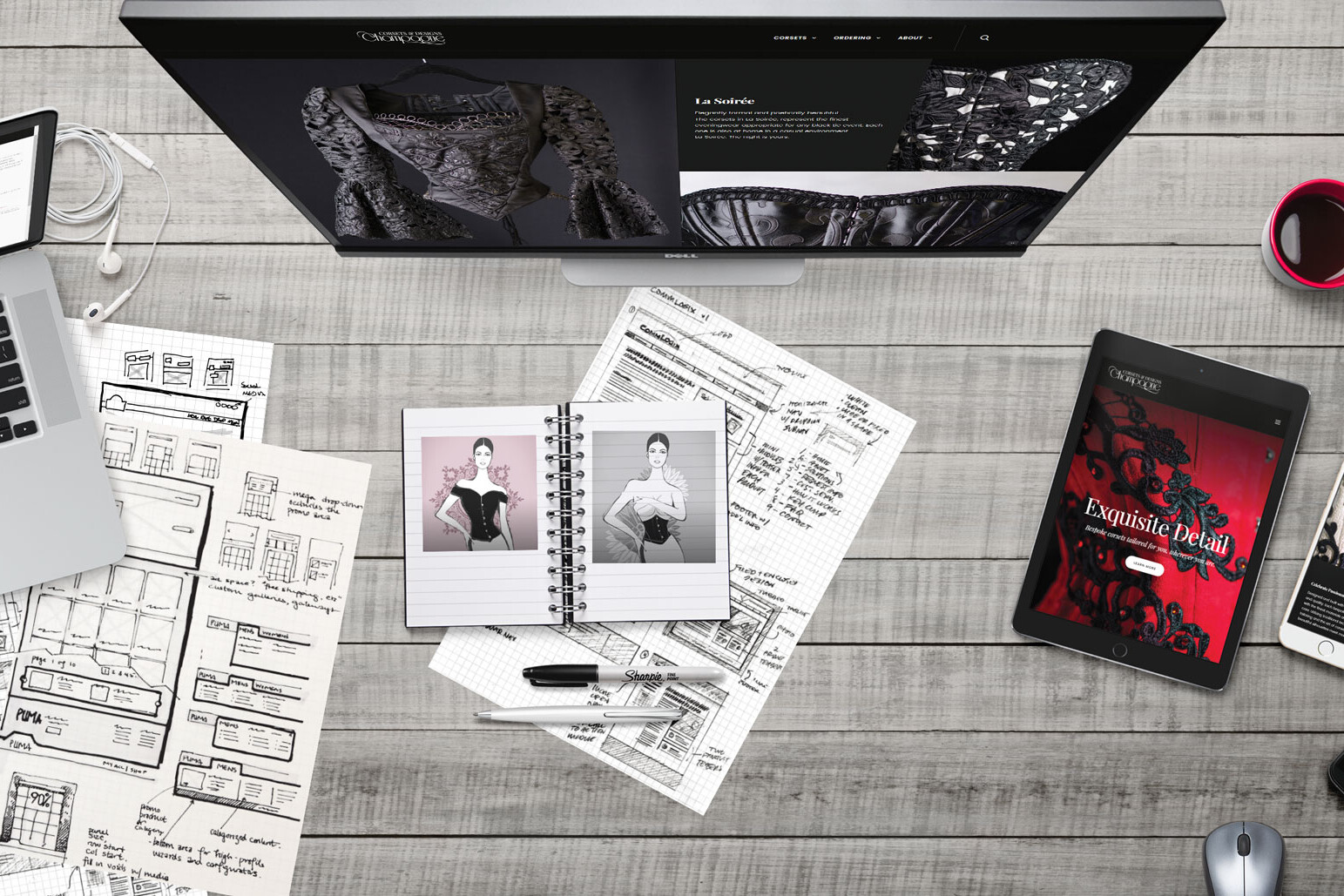
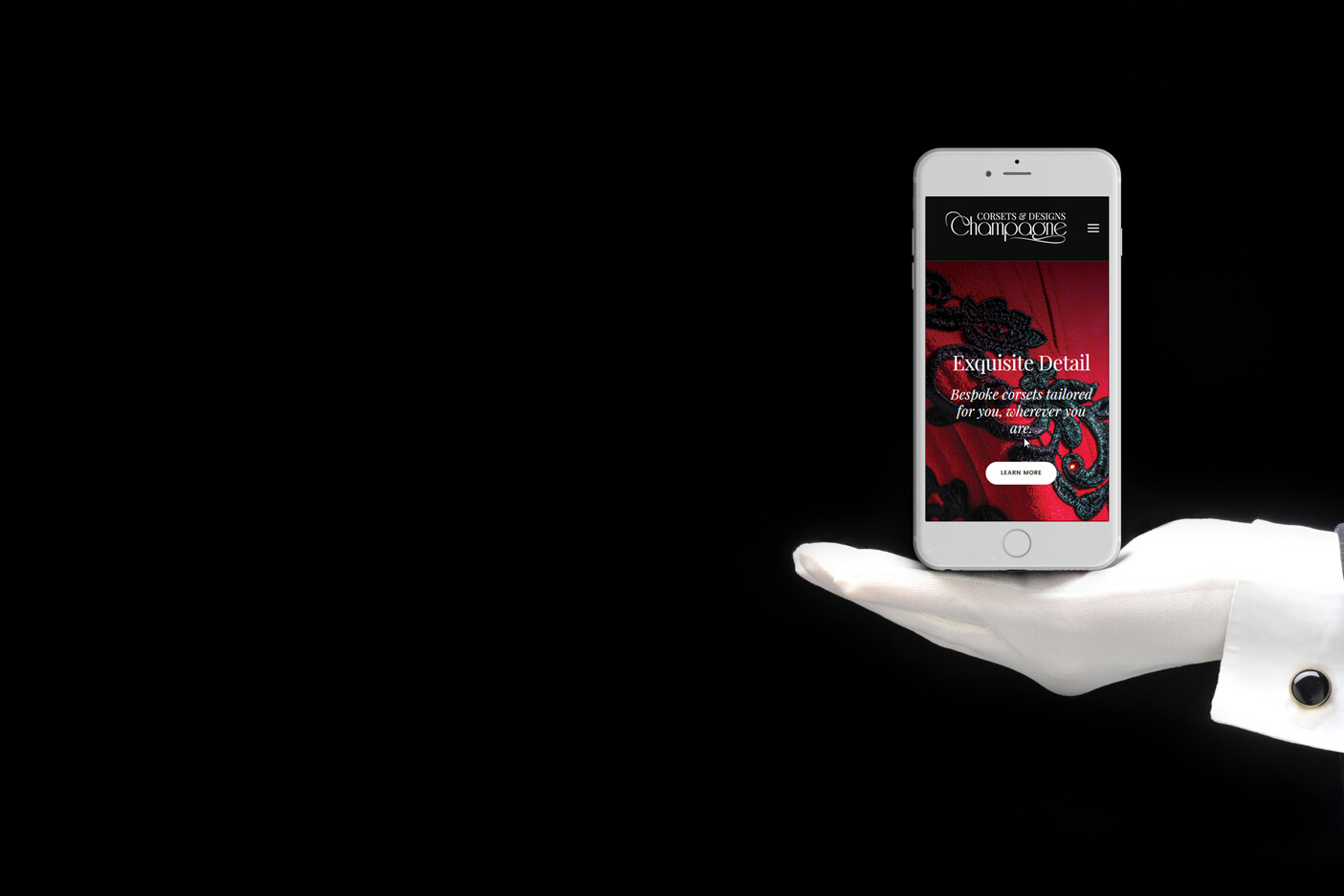
Not that long ago it was important to have a website so folks could find you online. Then, it became important to have a mobile-friendly website in case someone looked you up on their portable device. Now, your website should be designed with mobile-users in mind first, but still display nicely on desktops.
Personally, I might always favor a desktop, even over the convenience of a laptop. Don’t get me wrong, I love my smart phone (droid for me, of course, spent hours customizing my preferences just so), but these clumsy fingers are far more productive with a big keyboard and a fancy stylus and try as I might I can’t get my phone to work well with multiple screens. However, there is no denying that my phone gets used as much or more than the three other computers I spend time on (I know, right? No wonder I don’t get much sun!).
In 2013, worldwide use of mobile devices surpassed that of desktops. By early 2016, the majority of online sales were mobile-based. Starting next year Google will start to rank mobile-first websites above other sites. Their criteria is well documented and while they haven’t released a deadline, they indicate that it will be sometime in 2018. After that, you can expect to start seeing consequences.
Big Box CMS
Got Mobile?
Popular CMS platforms (Content Management Systems), like WordPress, Shopify, Squarespace Joomla, Drupal and others will certainly take these considerations to heart. Trust me, they are gearing up for it already. But note that their first concern is the usability and saleability of their own functions and services. They recognize that you and your developers spend more time on mobile devices than desktops and are designing interfaces that work well. Theme-makers however, are scrambling to create and publish mobile-first versions of their best-selling themes. Like anything else that is pushed out fast and sold cheap, beware of those ready-made (off the rack) themes, you may be paying to serve as a beta-tester to work out all the bugs.
In 2018, mobile-first websites will be the gold standard.
A Brief History of the Known Web
Got Mobile?
Over time, popular platforms and their themes will start functioning better and adapting to the user behaviors intuitively. But history has a way of repeating itself. Before CSS3 came out in the late 90s, the primary web design used tables to accomplish most layouts. This lent itself to some very boxy designs. Browser technology couldn’t render larger images and most developers hadn’t begun to leverage the finer details of CSS at all. In the early aughts, DIY platforms came on the scene and they built enormous libraries of code that can be used to style designs. Scripting language and hardware breakthroughs allowed for larger assets to be served quicker as well. These advancements and others allowed a shift in design. Websites took on a look that had larger header or banner pictures, with styled content below and footer navigation leading to similar pages. The next step introduced slideshows and they were all the rage 10 years ago (has it been that long?). As mobile-friendly sites gained popularity, slideshows were replaced with infinite scrolling pages. Most recently, full screen images, simple navigation and intuitive interactive content is in the forefront.
All along, some industries or brands have lead the way in and stayed up to date with the most modern and exciting layouts, enjoying the best returns on their investments. While, others dragged their feet, dismissing the internet is irrelevant (can you believe it? People still think that they’re business or brand doesn’t benefit from a web presence). These businesses end up joining the band wagon once they see their competition has updated or deployed some new technology or layout. By then, the way we use our devices and surf the web has changed again and after years of agonizing over whether it would be worth investing in digital marketing, a brand jumps in with both feet only to find that everyone else has moved on. Will your business benefit from new consumer behaviors, or strugge to join in just to keep up with the competition?
The Answer is in Your Hands
Got Mobile?
Whether you have a website or a mobile-friendly site, if you sell online, in stores or only to businesses, I leave you with these few questions: How many times per day do you look at your phone? How often does your target customer use theirs? When your customer hears of a new brand, or service, where do they look to find out how others have experienced it? When a potential customer discovers a challenge or a problem, where do they look for a solution. Before you go into a meeting with someone you haven’t met before, where do you look? Will you leave your competition behind and evolve your brand into what your customer wants it to be?
Get your Free Customized Website Assessment Now!
Fill out this short form to request a free 10-minute website assessment.
We’ll give you a summary on your site’s device usability, UX, page speed and SEO along with some expert advice.
Start leveraging your web presence to increase your profits, now!


- Upselling and Cross-Selling Infographic - November 28, 2017
- Share Like you Mean It - August 22, 2017
- Not Short for Apples - July 13, 2017