7 Website Mistakes You Don’t Want to Make
Avoid these website mistakes on your Intimate Apparel or Legwear site
Ignoring these tips could cost you money.
7 Website Mistakes You Don't Want to Make
You want an enjoyable experience when you’re online, right? You want a question answered or to be entertained in some way or to buy the perfect… fill in the blank. You want to find the things you want quickly and expect those things to be presented in a way that’s easy to use and visually appealing.
Guess what? That’s what your audience wants too!
Check out these 7 common mistakes you don’t want to make and to be sure you’re on the right track. Give your visitors what they want and keep them entertained, engaged and coming back for more.
Not Easy on the Eyes
7 Website Mistakes You Don't Want to Make
We’ve all seen them before, websites that use font colors that don’t have enough contrast to make for an easy read. For the love of eyeballs everywhere, please don’t use yellow text! Ever!
Colors aren’t the only offenders. Fonts can be a big problem too. Try to avoid fonts that are too fun, or at the very least keep them out of the body. Make sure to check that your fonts are legible on different browsers too. A common mistake we see is a font that looks fine on Safari but looks terrible on Chrome. If it’s hard to read, you can probably assume no one will read it.
Never Took a Walk in Their Shoes
7 Website Mistakes You Don't Want to Make
You’ve designed or approved the homepage and all the products are uploaded and categorized. Maybe there are some nice secondary pages that speed up the buying cycle or educate the customer. Everything looks good, right? If no one test drives the site from the user’s perspective, how will you know? Place a test order and go through the whole process. What happens when you mistype your credit card info? Does the PayPal module work as expected? What if you want to change your order halfway through checkout? So many of these things are easy to miss and often result in abandoned carts or lost customers.
Not Mobile Enough
7 Website Mistakes You Don't Want to Make
Everyone’s talking about mobile first, now. Meaning, the site should be designed for mobile devices first and then made responsive for larger screens. But, we’re still seeing websites that aren’t even mobile friendly. It may still be a big step to go all the way to mobile first, even as different industries cross the majority threshold to mobile, but a website that isn’t mobile friendly at all will certainly be left behind. Responsive design alone isn’t enough, you also need a mobile interface!
Hello World?
7 Website Mistakes You Don't Want to Make
Worse than a 404, more embarrassing than a blank page, uglier than missing assets or scripts: placeholder content. If you’re not going to bother to create content for a given page or element, why should the user stick around long enough to find anything worth seeing? A little quality control, or some good old fashioned double checking can find any broken links, typos or clumsy grammar that loses the flow of your brand message and makes for a poor user experience.
MIA Authors
7 Website Mistakes You Don't Want to Make
If you offer a blog or similar area on your website, you should regularly release content. Aside from the SEO value of consistent posts, you should consider what the reader thinks of your post frequency too. Three posts, dated a year old or more, does not make for a blog. Just as people flock to the gym and vow to start exercising every Jan. 1st, you’ll also see a bunch of random blogs that turn up every new year. If you aren’t prepared to make regular content, you should avoid it altogether.
SEO: Set It and Forget It
7 Website Mistakes You Don't Want to Make
I’m sure you hear the acronym SEO thrown around a lot. SEO stands for search engine optimization and is the process of getting traffic naturally from search engines. It’s a necessary part of a website and should not be ignored. SEO is not something you do once and then never touch again. It’s an ongoing process that needs to be maintained regularly. If you don’t have a methodology or support for an ongoing SEO campaign, you will quickly lose relevancy, and what good is a beautiful site that nobody visits?
Everybody Loves Pop Ups!
7 Website Mistakes You Don't Want to Make
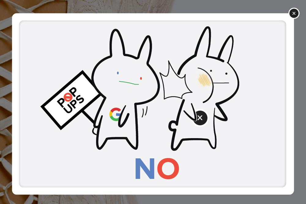
What I meant to say is everyone hates pop-ups. You know those window’s that pop-up and interrupt what you were reading or plead with you to stay just a little longer and receive a discount? Google actually penalizes sites for pop-ups and lowers their page ranking for this offense, but pop-ups are still rampant on the web. Do everything you can to minimize this annoying tactic. List building is important for any business but it can be done without frustrating your customers. You want happy customers, don’t you?
Are you making any of these common mistakes on your site? Maybe it’s time consider an update.
Download our free website redesign planner and start figuring out what you want and need from your website.

Ready to Convert
More Customers?
Download our free planner and get the clarity you need to build your dream website and get started on the path to a better web presence.
- 7 Website Mistakes You Don’t Want to Make - May 18, 2017
- 5 Things You Didn’t Know About 3D Photography - May 5, 2017
- Target your Audience for Fun and Profit - April 24, 2017
Related Articles
The Face of Your Business
Branding,Business Management,Marketing,Technology,Retail,Communication
April 17, 2017
0 Comments6 Minutes


